The brief
Postgres, across many machines
Citus Data makes Citus, an extension that turns PostgreSQL into a distributed database, spreading data and queries across many machines so Postgres can keep scaling.
Client work · 2016 · for Citus Data
Drawn for a launch, kept for years.
For the launch of Citus 5.0 in 2016, we drew Citus Data an animated illustration of its distributed database, and it stayed on their website for years. In 2017 we came back to refine the site around it.
The brief
Citus Data makes Citus, an extension that turns PostgreSQL into a distributed database, spreading data and queries across many machines so Postgres can keep scaling.
The challenge
In March 2016, Citus 5.0 was about to unfork from Postgres and go fully open source. Citus wanted an illustration for their homepage and a new page for developers and enterprise users, added straight into their Drupal site, on a one-week timeline.
What we made
An isometric illustration of Citus's databases, animated with SVG and CSS, a set of icons, and the new page as custom HTML for Drupal. A year later, on their new Middleman site: new icons, customer stories, calls to action, SEO and a downloads page.
The launch
Citus Data makes Citus, an extension that turns PostgreSQL into a distributed database, spreading your data and queries across many Postgres machines so you can keep scaling without leaving Postgres. In March 2016 they were about to launch Citus 5.0, the release that unforked Citus from Postgres and made it a Postgres extension, fully open source.
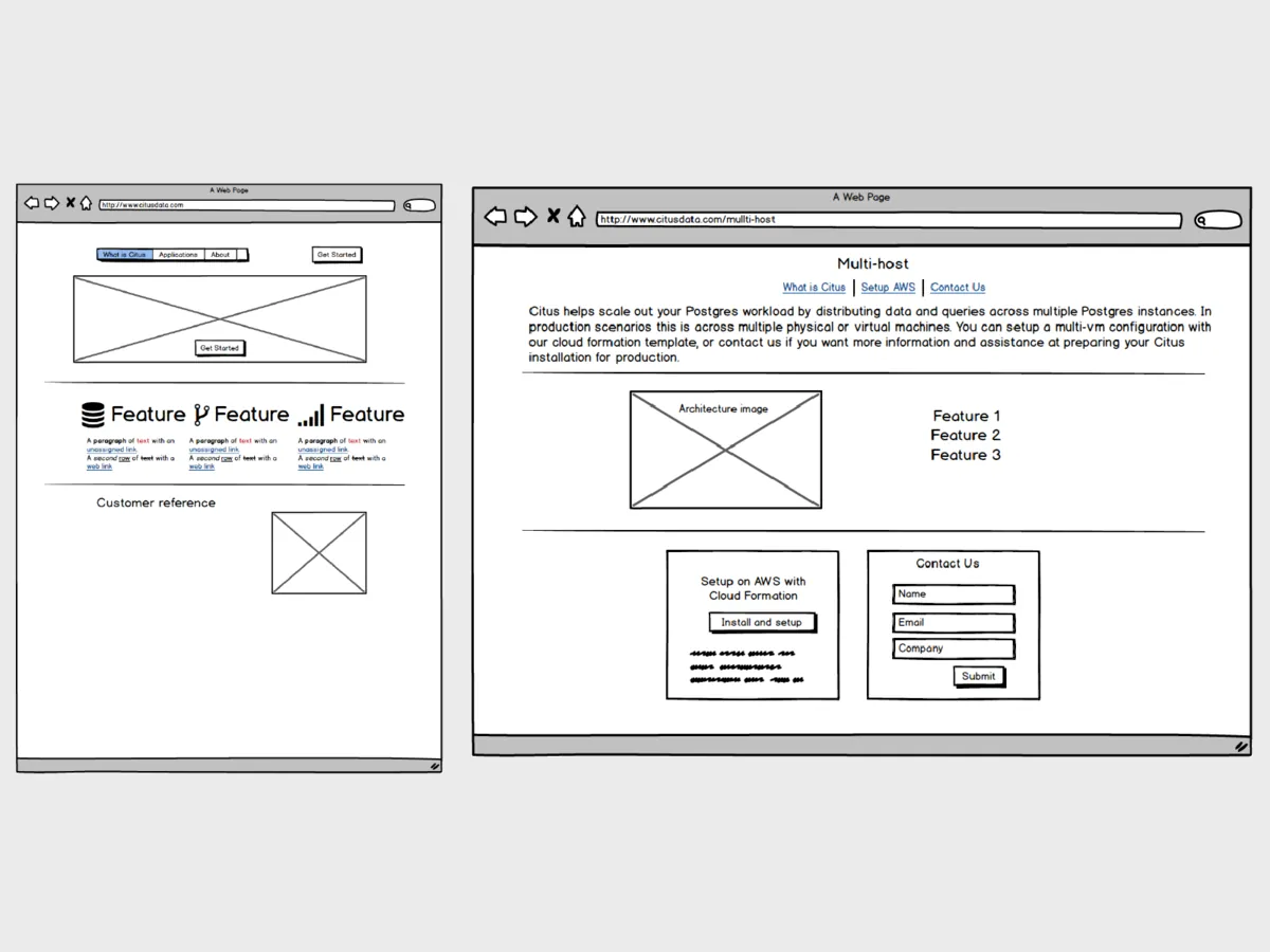
Ahead of that launch, Citus wanted an illustration of their data sharding for their homepage and their branding, and a new page for developers and enterprise users. We had about a week to do it, so a Slack room was set up for everyone to work in together, and the wireframes, icons and designs were talked through in real time there and on Google Hangouts, so Citus could approve each step as quickly as possible.
The illustration
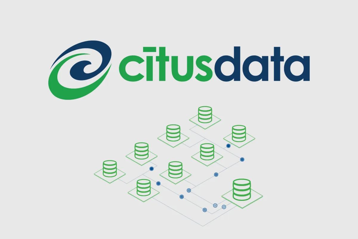
The illustration is ten Postgres databases, each standing on its own isometric tile, nine small and one larger, drawn in green and joined by thin blue lines. Chris drew it in Illustrator, and we showed Citus a few designs to choose from before finishing the one they picked.
Then we made it move. On the site it isn’t a picture but an SVG, with CSS animations sending small blue dots out of the large database and along the lines to the small ones. Each dot has its own path and its own timing, from under two seconds to five, and fades in as it leaves and out as it arrives.
In motion
This is the illustration as it ran on Citus’s website, taken from their own repository: the same SVG and the same CSS animations. All we’ve changed is the names of its classes, and we’ve added a way to pause it.
Pause it whenever you like. If your device asks for reduced motion, you’ll see it still, without its dots.
The page
The new page went into Citus’s existing Drupal site, and the brief was to add it directly, so Citus could focus on marketing the launch rather than on their website. There was no repository for it. We wrote the page as plain HTML, with a stylesheet of our own to match the design, checked it on a staging copy of their site, and pasted it into Drupal’s page editor, keeping a copy on our Google Drive as the backup.
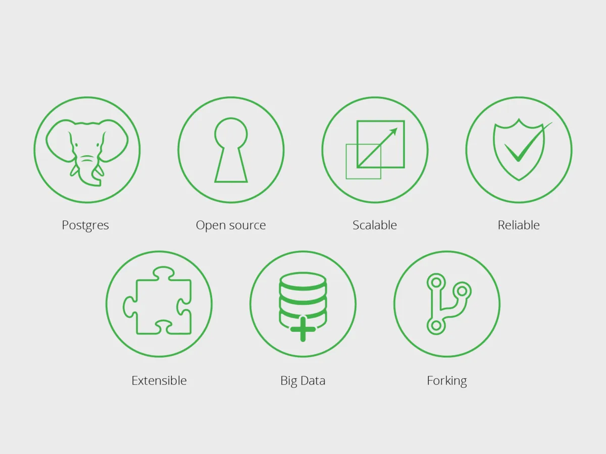
Their Drupal theme already loaded Font Awesome and jQuery, but not Bootstrap, so the page brought its own stylesheet for everything else. It carried a set of custom icons Chris drew for it, seven green line icons in circles, for Postgres, open source, scaling, reliability, extensibility, big data and forking.

The long run
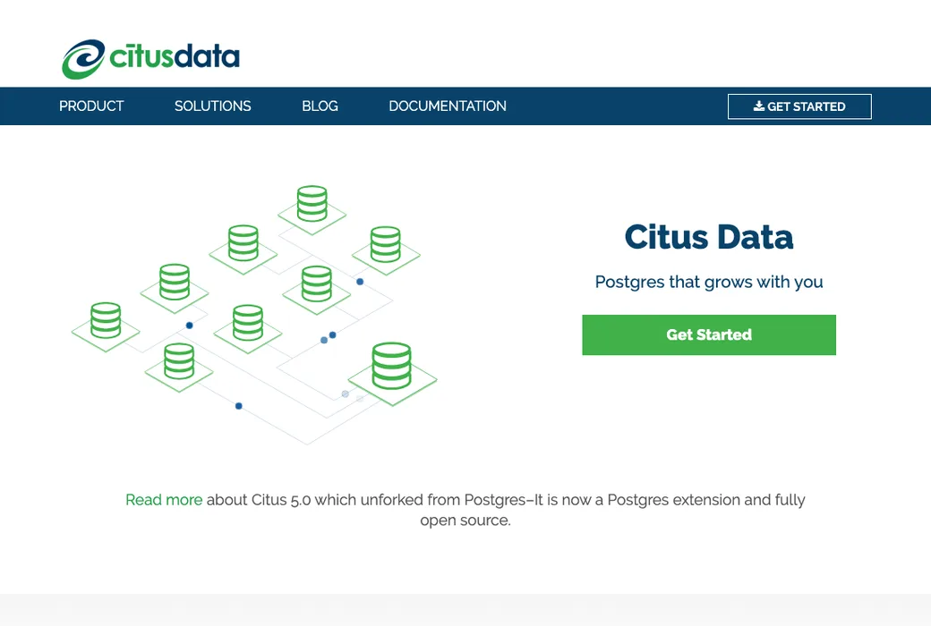
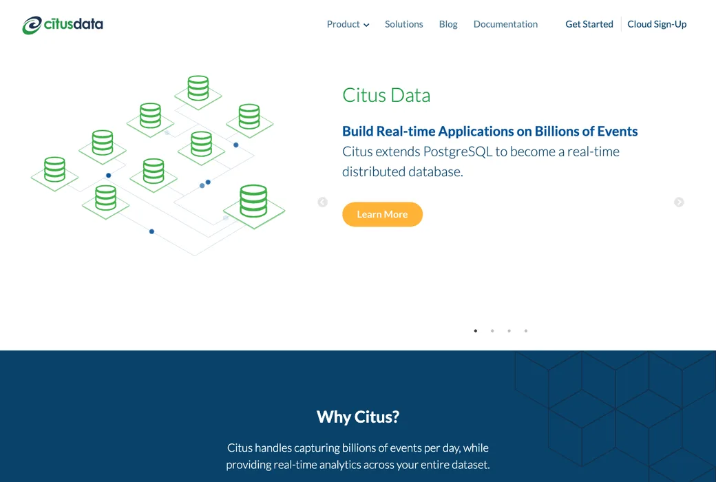
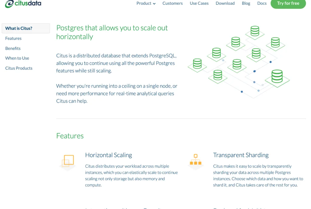
Later that year, Citus moved to a new website built on Middleman, and the illustration came with it, still animated, as the hero of the new homepage and at the top of the product page.
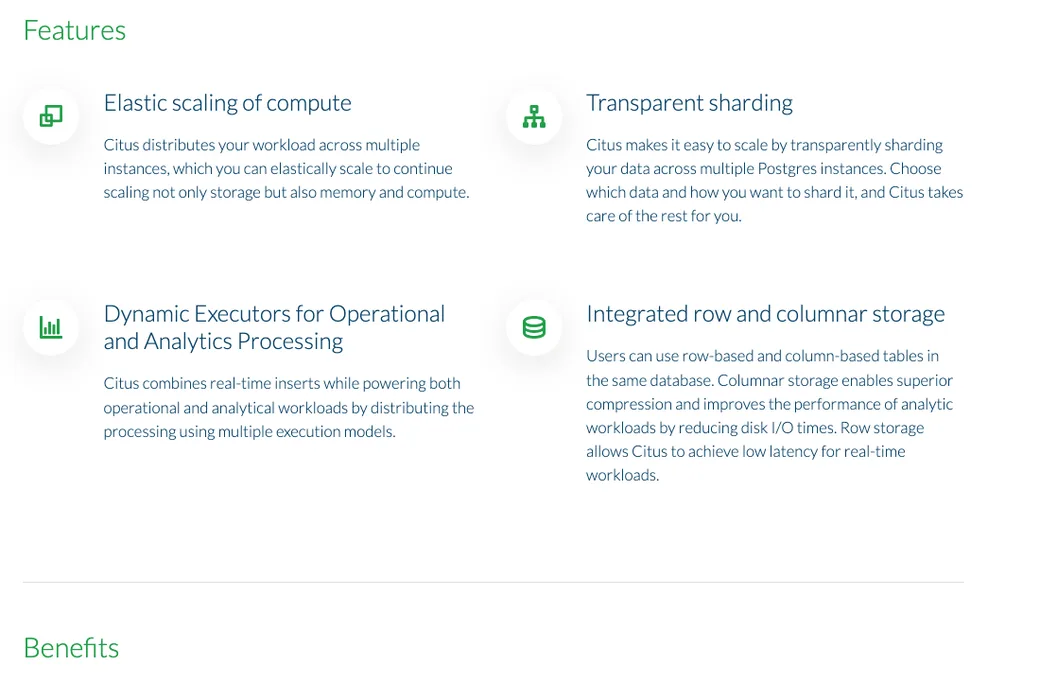
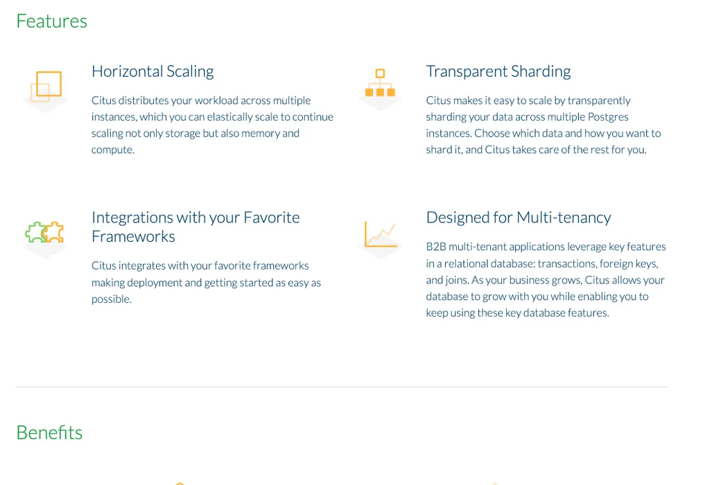
A darker version of it was still on their pricing and demo pages in March 2019, the last month in the site’s repository. Step through three of the pages it lived on, as the Wayback Machine kept them.
A year later
In February 2017 Citus asked us for ideas to refresh and improve the new site, which by then lived on GitHub and deployed to Heroku, with a review app for every pull request. We agreed a list: rework the customer pages to make room for more case studies, new feature icons to match the benefits, hover states for the buttons that had none, a strip of client logos, a call to action at the bottom of every blog post, SEO descriptions and keywords across the site, and a handful of fixes.
Chris designed the new icons, calls to action and logo strips, and Matt built all of it, in pull requests to Citus’s own repository, for their team to review. The feature icons on the product page had been small green glyphs in white circles. Chris drew a new set, larger and in orange and green, each standing on its own grey isometric tile, and after the first round he resized them and adjusted their strokes.
Customers
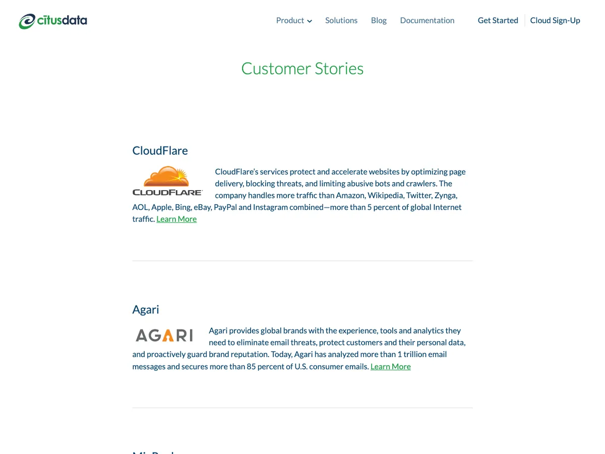
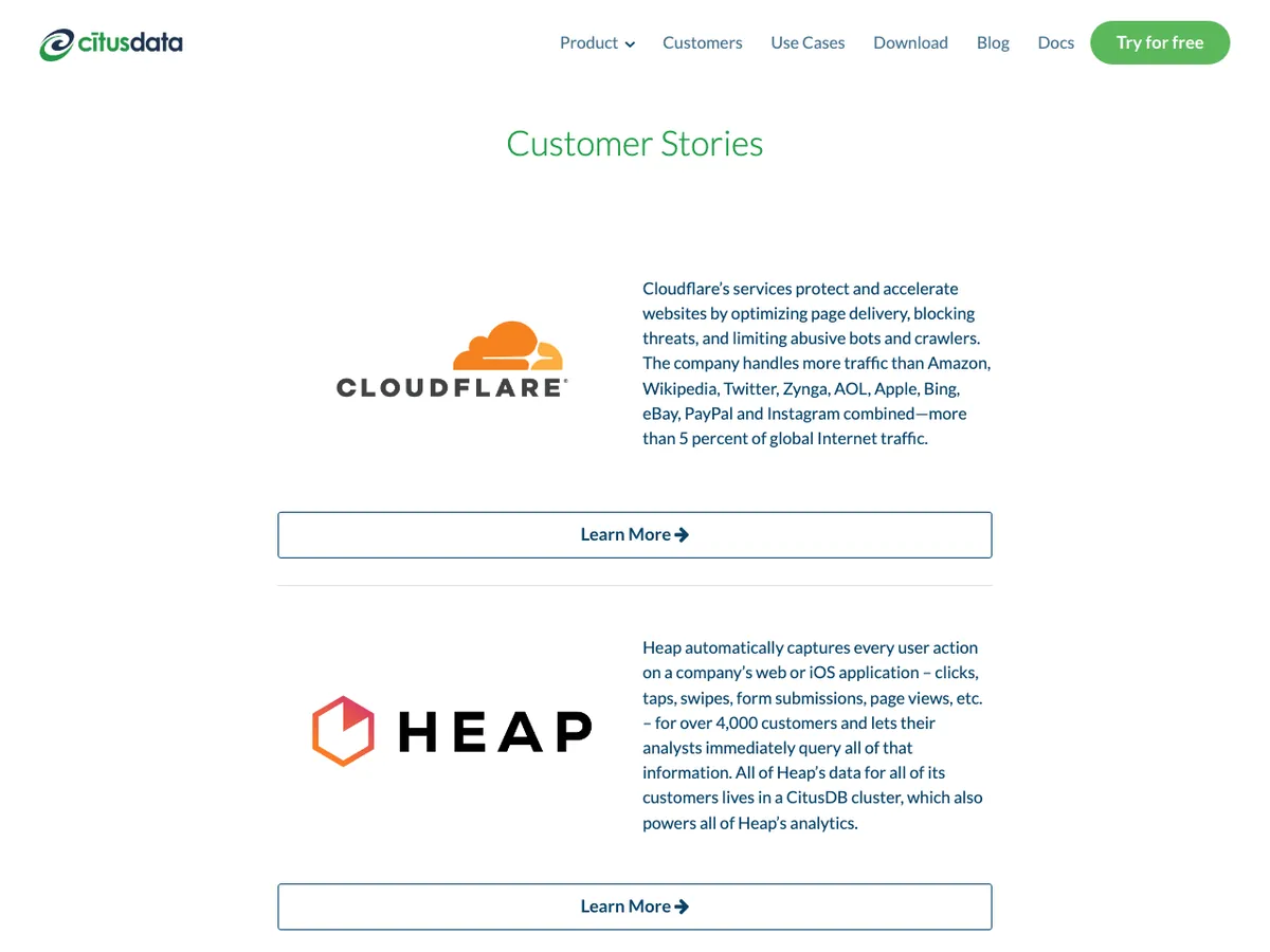
Citus’s customer stories were a list of logos and paragraphs that was only going to get longer, and the brief was to be ready for more of them. We gave each story a row of its own, with the logo large on the left, the story beside it and a full-width button to read it, then reworked the layout of the list again after Citus’s feedback.
We swapped most of the logos on that page for high-resolution ones, and added a strip of client logos, all the same size, to the top of the use cases page and the foot of the infrastructure solutions page, with a smaller “mini” strip for the tighter spots.

Calls to action
Citus wanted a call to action at the bottom of every blog post, to bring in new registrations. Their posts were Markdown files in the repository, so we wrote a small Middleman extension, middleman-cta, and published it as a gem. Each call to action is defined once in a data file, with its image and where it goes, and a post places one with a single line, like [cta:wide-blog-subscribe].
Chris designed the first three, for subscribing to the blog, signing up and registering for a webinar, and within a few weeks Citus’s own team was adding them to their posts.
SEO went in alongside it. We added middleman-meta-tags with defaults for the whole site, then wrote a description and keywords into the front matter of every section, from the product pages to the guides and the about pages.
Made for this site
We wrote it in March 2017, specifically for Citus’s website, so their team could put a call to action in any blog post with one line, and we gave it back as open source. It stayed in their site until the repository’s last commit.
[cta:wide-blog-subscribe]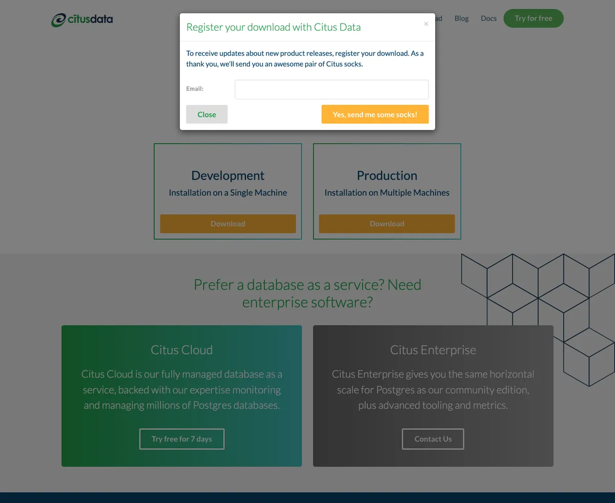
Downloads
At the end of April, Citus asked us to finish a new downloads page they had started, which invited people to register as they downloaded, and to join the newsletter if they liked, then showed them how to install Citus. As a thank-you for registering, Citus offered a pair of Citus socks.
Their draft already had the two choices, Development on a single machine and Production across several, each opening its install instructions in a dialog. We tidied the layout at the top of the page and the instructions in the dialogs, and set the registration form’s fields beside their labels. Below them we added two callouts for anyone who’d rather not run Citus themselves, Citus Cloud and Citus Enterprise, in gradients, over an isometric wireframe that’s hidden on small screens.
The product page’s menu floats beside the content as you scroll. We made it follow along, with a few lines of jQuery that highlight whichever section you’re reading.
Some of the list was small and fiddly: the Sign Up button sitting out of line in the navigation bar, hover states for the buttons that had none, and spacing tightened on the homepage and the downloads page.